August 3, 2026 · Martina Pérez
How do you represent something invisible?
Pain can't be seen. Yet we feel it, need to communicate it, and try to understand how it changes over time.
At the beginning of 2026, I started a series of personal projects to understand how far I could use AI to build real products, and which tools were better than others depending on the problem I wanted to solve.
One of those projects became Vagalume, a web app for tracking headaches and understanding pain over time.
I suffer from headaches myself, so it was an opportunity to design something I could actually use, test continuously, and validate whether it was genuinely useful.
My original goal was simple: understand my headaches without having to remember everything myself, and have a way to validate my own hypotheses about what might be contributing to them over time.
Why not a form?
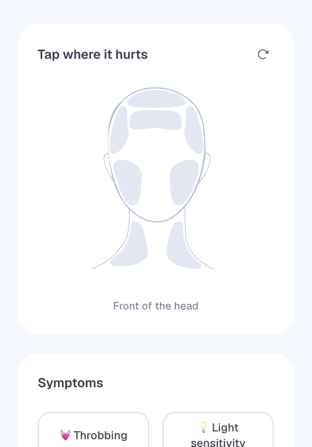
The first version used a 2D model to map pain areas.
Replacing a traditional form felt like a better interaction from the beginning.
Imagine trying to describe your pain through fifteen anatomical labels. Not only do you have to read them while logging your symptoms, but you also need to interpret those same labels later when trying to understand what happened over weeks or months.
Seeing the information spatially also makes understanding how pain evolves over time much easier than reading lists of symptoms.
Selecting directly on a visual representation reduces that cognitive load and makes historical patterns much clearer.
It worked, but while I was building the 2D version, it became obvious that it wasn't enough. Some regions couldn't be represented naturally, and users were often confused about the exact area they were selecting. The silhouette itself felt too simplistic and people didn't really identify with it.
The 2D version wasn't wasted effort, though. It helped me build the product architecture and validate the core logic before moving to a richer interaction model.
Moving to 3D
I began experimenting with an interactive 3D head.
The first iteration was simple. It didn't have the visual design I wanted. I only wanted to answer one question:
Could anatomical regions be mapped onto a 3D model in a way that felt natural?
That turned out to be much harder than I expected.
Defining the anatomical regions wasn't particularly difficult from a design perspective. The challenge was mapping them onto the 3D model so they wrapped naturally around the surface. It took many iterations to get the regions to adapt organically without breaking the polygon mesh, creating duplicated polygons or producing hard edges.
Once I had this first version, I tested it with users.
The surprise
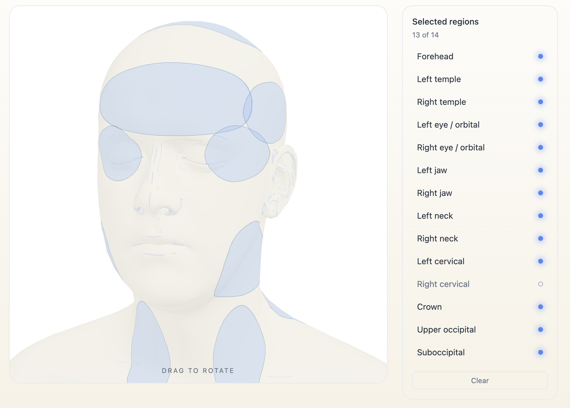
I expected people to comment on the 3D model itself. The interaction. The visual representation of pain. The selectable areas. For me those were the interesting design questions.
Instead, they focused on something completely different.
One user said:
"This is great, but I also want to select my ears."
I asked:
"Why would you want to select your ears in a headache tracking app?"
The answer was immediate.
"Because my ears hurt too."
Another user asked why they couldn't select their nose.
That conversation completely changed how I looked at the project. People had almost forgotten they were using a headache tracker. They simply wanted to describe what hurt.
The 3D model had become a means to an end. They weren't interested in the model itself. They simply wanted the freedom to describe their own experience as accurately as possible.
The more human and detailed the model became, the higher users' expectations of the product.
Once people could freely rotate the head and select almost any area, they stopped thinking about the interface. They started behaving naturally. They were no longer constrained by the options I had given them. Instead, they simply tried to describe their own experience. And that's when I realised something.
The more freedom they had, the more precision they wanted.
Representing pain
Once the region mapping was solved, a completely different challenge emerged.
How do you represent pain itself? Should it feel fluid? Resistant? Should it change shape? Or simply pulse?
I stopped designing a 3D object and started experimenting with materials and visual languages that could translate a physical, internal experience.
I explored different possibilities. Fog. A heartbeat. A material moving slowly with resistance. At one point I considered representing pain as a liquid, but discarded it. Pain rarely feels like a liquid. It can pulse, spread, feel heavy or resistant, so I kept exploring other visual languages instead.
Creating the fog was almost like building a 3D model inside another 3D model. Getting that volumetric feeling inside every selected region took days of work. Not only because I had to understand how to guide the AI tools towards the effect I wanted, but because I also had to understand which representation best communicated pain.
The visual effect itself mattered much less than what it communicated.
In Vagalume, the calmest of them won. Your history shows as a still, soft density that gets darker the more an area has hurt, and only a headache in progress moves.
The effect of realism
This project reminded me of another one I worked on years ago at Moonpig.
There, I designed a 3D experience to help customers understand the real size of a greeting card before buying it.
The surprising part was that, once people realised how large the giant card actually was, they didn't scale back. They chose the giant card even more often. They wanted to surprise someone they cared about.
The experiment significantly improved card upsell.
In e-commerce, 3D helped people understand the scale of a gesture, not just the size of a product. In this project, it's helping me explore how to give visual form to pain, something we all experience, but nobody can actually see.
Building changed the design
When I started these projects, I thought the biggest advantage of AI would be building faster. Today, I don't think that's the biggest change. The most interesting part has been experimenting.
AI doesn't generate the final result in a minute. It generates something you continue designing.
Every iteration revealed something I hadn't predicted. Experimenting with the technology changed how I designed the product, making it much more aligned with the natural behaviour of users.
The model is now part of Vagalume: you mark where it hurts directly on the head, and over time it shows where it hurt most.
When users behave naturally, they reveal what your product should become.